Adding a New Product in Sanity Studio
To add a new product in Sanity Studio, follow these steps:
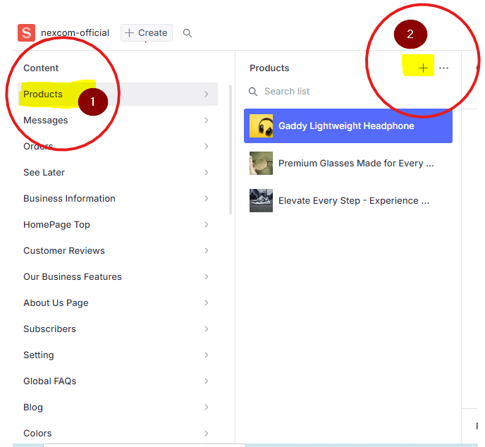
- Navigate to Sanity Studio and select the Products collection.
- In the second column, click the + icon to create a new product.
Below is an image highlighting the area where the + sign is located for your reference:
For demonstration purposes, we will add a product titled Realme Buds Air 2 (earsbuds) to the product collection. Follow the steps below to complete the product entry, ensuring all required fields are properly filled.
Field Grouping Overview
When you first access the product entry screen, you will notice that fields are organized into groups for easier navigation, as highlighted in the image below. By default, the "All Fields" group is selected, which displays every field available for the product. If you wish to view a subset of fields, you can select a specific group from the list to focus on only those relevant to that group.

Title
The Title is the first field to fill when adding a product. This field is crucial as it represents the product across your store and search engines. It is a required field, meaning you cannot proceed without filling it.
For the best results, insert a unique and attractive title that captures the product's essence and appeals to your customers. For example, you might use something like "Realme Airbuds" for a set of wireless earbuds.

isFeatured
The isFeatured field is a boolean field and plays a crucial role in determining whether a product appears on the homepage. To maintain performance and reduce heavy page load, we limit the number of products displayed on the homepage by default to 20.
If you want a product to be showcased on the homepage, set this field to true. Otherwise, the product will not be featured on the homepage.

Slug
The Slug field represents the URL of the product. By default, it is automatically generated based on the Title field. It converts the title text into a URL-friendly format by replacing spaces between words with hyphens (-).
To generate the slug, simply click the Generate button. It will automatically create the URL for the product.
Note: If another product with the same title already exists in the project, it will not generate the slug and will throw an error. Ensure the product title is unique.

Description
The description field is where you provide a brief summary of the product in 2-3 lines. It should encapsulate the key features of the product in a concise manner, giving an overview of what the product offers without going into full details.

Price
The price field is the fourth important and required field. Set the price of the product that will be displayed on the website.
After filling out the four required fields — title, slug, description, and price — the product is ready to be published. Before completing these fields, the publish button will be disabled.
Please refer to the image below for guidance:


After publishing the product, you can view the product by visiting your website.
Price For
The Price For field is optional, but it is beneficial to include a value here. This text will provide clarity regarding the pricing. For example, you might enter a phrase like "1 earbuds set" (or another description that you consider best). This will help customers understand exactly what they will receive for the specified price.
Price Note
The Price Note field is optional, but similar to the Price For field, it is beneficial to include a value here. For example, you might indicate, "A 20% discount will be applied if two or more items are purchased." This helps inform customers of any special pricing offers related to their purchases.
Referral Commission
If you have enabled the referral program for your products, you can enter a commission amount in this field. This amount will be awarded to referrals who share your product and generate an order containing their referral ID. For example, if a product is priced at Rs. 2200, and you want to pay Rs. 200 to anyone who shares your product and successfully brings in a purchase through your website, simply add Rs. 200 in this field.
Minimum Quantity:
In this field, you can define the minimum number of items that must be ordered. If you are selling retail, you can leave this field empty.
Cover Image
The cover image is the primary image that will be displayed on the product card, such as on the homepage, categories page, or recommendations page.
To upload an image, click on the 'Upload' button, select your image, and it will be uploaded. If you want to choose from images that have already been uploaded, click on 'Select'.
You can set alternative text for the image, which helps describe what the image is about. This text is beneficial for both machines and humans, especially if the image fails to load correctly. Providing clear and concise alternative text enhances accessibility and improves the user experience on the website.
Please note that while the four fields mentioned earlier are mandatory to publish the product, if a product does not have an image, the application will not fetch it for display on the website.
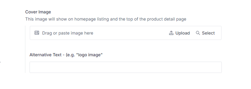
Note: Products without a cover image will not be displayed on the website.
Image Gallery
The Image Gallery allows you to upload multiple images for a product. These images are displayed at the top of the product detail page as a slideshow. The procedure to upload images is the same as the cover image. However, in the gallery, you can add more than one image in a sequence. Simply click on the "Add Item" button, which will open a dialog box to either upload new images or select from previously uploaded images.

Colors
If your product comes in multiple colors, you can specify them by adding color names. To add colors, click on "Add Item," and a new UI will open. This is a referenced document to another collection called 'colors'. By default, necessary colors are already added with their names. You can select a color by typing its name in the open dialog field.
For example, if you type 'black' (as our earbuds also come in black), suggestions for one or more matching colors will appear. Simply click on the desired color to select it. That’s all, you've added a color!
To add another color, just repeat the process.


If you do not find your desired color name in the list, you can create a new one with a custom name and value. We will cover the steps to add a new color in detail later in the Add Colors chapter.
Sizes:
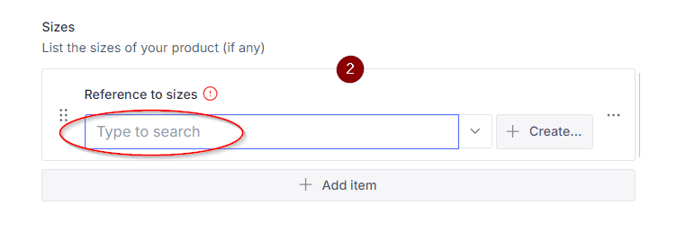
Similar to colors, you can also add sizes if your product has size variations. Follow the same steps as in the colors section to add sizes. However, unlike colors, sizes are not pre-defined. You will need to create sizes by providing the name and appropriate nomenclature. For example, Small (SM), Medium (MD) or Large (LG) etc
To learn more about how to add sizes, please visit the Add Sizes chapter.

Accessories
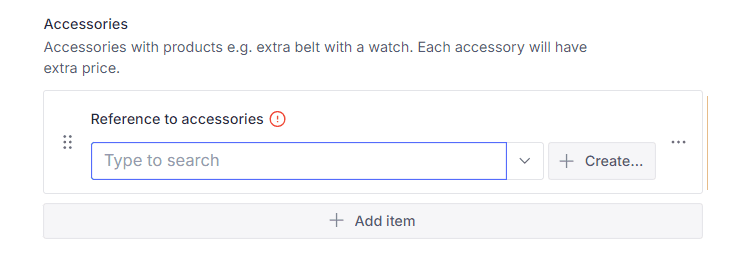
The accessories field is used for adding any accessories that come with your product. Each accessory can have its own price, which will be added to the base price of the product.
You can think of accessories as add-ons to a product.
For example, In our dummy product,we have a leather pouch with straps for handling the earbuds case, if customer chooses to add this accessory to their purchase, its price will be added to the original price of the earbuds.
To add a new accessory, click on "Add Item" and then click on the "Create" button (if no accessory has been created yet). This will open a new user interface where you can define the accessory. For more details on how to add accessories, please visit the 'Add Accessories' chapter.

Feature Block Section
The Feature Block section allows for dynamic design, showcasing the product’s key features on the product-detail page. To add a new block of content, click on "Add Item", which will open a new interface. Typically, three fields are enough: heading, description, and image.
For more detailed customization and to create a more engaging product presentation, refer to the relevant documentation.
Content Section
The Content Section is where you can provide a detailed overview of the product using plain text. This text box leverages Sanity's Portable Text feature, which allows for rich-text editing. With Portable Text, you can easily apply formatting such as adjusting font sizes, making text bold, italic, and more.
Sanity's Portable Text behaves like a flexible content editor that supports a variety of formatting and structure options, enabling you to create well-organized and visually engaging product descriptions.
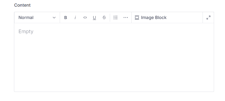
So far, we have added all the necessary items for our product. This is sufficient to make it live on the website. However, if you're working within a broader scope of e-commerce, you may want to include additional details, such as Category, Vendor, Product Family, and other optional fields.
Now, we will briefly explore all the remaining fields to finalize the documentation. Although many of these fields are not in active use, we'll cover them in order to get the documentation accomplished.
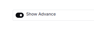
Show Advanced Button
The rest of the fields are hidden by default. To view them, toggle the "Show Advanced" button to true. Once enabled, all the hidden fields will become visible for further editing.
Category
This field allows you to add or assign a category to the product. If categories are already created, you can select one by typing the category name in the input field. To learn more about adding categories, visit the Add Category section.
Attaching a category to a product is only essential when you have a diverse range of products across different categories. For instance, in our NEXCOM Store, we sell four types of products, each organized into its respective category.
Product Family
The Product Family field offers a more dynamic way to categorize products. Each category can have multiple families. For example, under the category Kitchen Accessories, there could be families like Jars & Oil Pots, Juicers & Choppers, and Knives & Cutters.
Vendor
The Vendor field allows you to add the main supplier from whom the product was purchased. While this field is optional, it can be helpful to track the product's source if needed.
Short Name
The Short Name field is a short and concise name (generally in one or two words) of the product. Though it is rarely used in the app currently, you can still add it. This field may become useful in future app updates.
Art No & Brand Fields
These fields are optional but can improve the user experience. The app may use their values to display relevant products to customers based on the Art No or Brand entered.
Off - Percentage of Discount
This field will be useful in future development when we implement discount features for all or specific products. The Off value will represent the percentage of the discount applied to the product.
Stock Status
The Stock Status field provides three dropdown options for you to select the current availability of the product: Low Stock, In Stock, or Out of Stock. Choose the option that best represents the product's current status.
Priority
The Priority field determines the display order of products within the app. Products are arranged based on their priority number: the lower the number, the higher the product will appear on the website. In other words, product with priority value 1 will display first and product with priority value 2 will come after it
Size Chart
If your product requires specific measurement parameters, you can upload an image of a size chart. This chart will help customers understand the measurement details of your product, ensuring they select the right size.
Background Color
The background color value is not currently utilized in the app. However, it may be incorporated in future development plans to enhance the visual appeal of the application.